Forecasting in Excel allows you to predict future values from existing data points Excel offers several forecasting functions to help you analyze past trends and extrapolate them into the future
The two main forecasting functions in Excel are
- FORECAST.LINEAR – Predicts a future value along a linear trendline
- FORECAST.ETS – Predicts a future value using exponential triple smoothing
These functions can help you forecast sales, website traffic, production volumes, and many other metrics. In this comprehensive guide, we’ll cover everything you need to know to start forecasting in Excel.
Why Forecast Data in Excel?
Before we dive into the specifics, let’s look at some of the benefits of forecasting data in Excel:
-
Understand Trends: Analyzing historical data patterns allows you to spot trends and cycles. You can see if a metric is increasing, decreasing, seasonal, cyclic, or random.
-
Predict the Future: Once you identify a pattern, you can use it to predict future values. This helps with planning, budgeting, capacity management, and setting targets.
-
Identify Issues: Forecasting also helps you identify abnormal changes or outliers in data. You can investigate the root cause and take preventive action.
-
What-if Analysis: You can model different future scenarios by varying the forecast parameters. This allows sensitivity analysis for decision making.
In short, data forecasting brings predictability, helps organizations plan better, and drives data-driven decision making. Now let’s see how to do it in Excel.
Using FORECAST.LINEAR
The FORECAST.LINEAR function predicts a future value based on existing values. It plots a linear regression trendline using the least squares method.
Here is the syntax:
=FORECAST.LINEAR(x, known_y's, known_x's)
Where:
- x = the x-value for which we want to predict the y-value
- known_y’s = the array or range of known y-values
- known_x’s = the array or range of known x-values
Let’s look at an example:
![FORECAST.LINEAR example][]
In this example, we want to forecast website visitors for the month of October 2022.
The syntax is: =FORECAST.LINEAR(E3,$B$2:$B$11,$A$2:$A$11)
Where:
- E3 = Value along the x-axis where we want to forecast (Oct 2022)
- $B$2:$B$11 = The known y-values (visitor counts from Jan to Sep 2022)
- $A$2:$A$11 = The known x-values (the months)
We use absolute references for the known x’s and y’s so we can drag the formula down.
The result is a forecast of 94 visitors for October 2022.
To visualize the forecast:
- Select the data range
- Insert a scatter chart
- Add the FORECAST.LINEAR formula
- Excel will plot the linear forecast line
This clearly shows the expected visitor count for October 2022 along the trend.
Using FORECAST.ETS
The FORECAST.ETS function gives forecasts using exponential triple smoothing. This takes seasonality into account.
Here is the syntax:=FORECAST.ETS(x, known_y's, [seasonal_periods], [data_completion], [aggregation])
The first three arguments are the same as FORECAST.LINEAR. The next two are:
- seasonal_periods = Length of seasonality (0 for automatic detection)
- data_completion = 0 or 1 (1 if your data has missing values)
- aggregation = 0 or 1 (1 for aggregated data, 0 for non-aggregated)
Let’s see an example:![FORECAST.ETS example][]
The formula in F3 is: =FORECAST.ETS(E3,$B$2:$B$17,0,0,0)
We are forecasting the visitor count for October 2022. The zeros tell Excel to:
- Detect seasonality automatically
- Assume no missing values
- Use non-aggregated data
FORECAST.ETS gives us a forecast of 89 visitors.
The forecast line on the chart shows the seasonal pattern being considered.
Using Excel’s Forecast Sheet
Another easy way to generate forecasts is using Excel’s inbuilt Forecast Sheet tool.
To use it:
- Select your historical data
- Go to Data > Forecast > Forecast Sheet
- Configure forecast settings
- Click Create
This gives you a dedicated sheet with the forecasts, a chart, and forecast statistics like confidence intervals.
The steps are:![Forecast Sheet][]
The Forecast Sheet uses FORECAST.ETS internally but gives you more details on the predictions.
Charting Forecasts in Excel
Visualizing the forecasts along with the historical data gives more context and insights.
To create a forecast chart:
- Set up the data table with columns for the x-values, y-values, and forecasts
- Select the data
- Insert a 2D line chart with markers
- Excel will plot the forecast line
You can also add a trendline to an existing chart:
- Create a scatter chart with the historical x and y data
- In the Chart Elements, add a Trendline
- Set Forecast to the number of periods you want predicted
- The trend forecast will be shown
Forecasting Errors and Accuracy
No forecasting method is 100% accurate. It’s important to measure the margin of error in your predictions.
Two key metrics for this are:
- MAPE (Mean Absolute Percent Error) – Takes the absolute % error for each prediction, averages them. Lower is better.
- MAD (Mean Absolute Deviation) – Averages the absolute differences between predictions and actuals. Lower is better.
To assess if your forecasts are reasonably accurate, calculate these metrics. Tweak the model parameters if needed to improve precision.
Best Practices for Forecasting in Excel
Here are some tips for effective and accurate forecasting in Excel:
- Have sufficient historical data points – at least 30 to 50 periods
- Use time-series data with consistent intervals (daily, weekly, monthly etc.)
- Check for seasonality and cycles in the data
- Try both linear and exponential smoothing methods
- Visually inspect forecasts against historical graphs
- Measure forecast errors using MAD and MAPE
- Use absolute and mixed cell references correctly
- Update forecasts frequently with new data points
- Document your methods and assumptions
Limitations of Excel Forecasting
While quite robust, Excel does have some forecasting limitations:
- Doesn’t handle very large complex datasets well
- Limited to a few basic forecasting models
- Difficult to optimize smoothing factors
- Hard to integrate predictive machine learning models
- Not suitable for multivariate forecasting
For large scale forecasting problems, dedicated software like R or Python would be more suitable. But Excel is a quick and easy starting point in most cases.
Now you have a clear understanding of how to leverage Excel’s inbuilt forecasting capabilities for predictive analytics.
FORECAST.LINEAR and FORECAST.ETS provide a fast way to generate linear and exponential smoothed forecasts from historical data.
Visualizing the forecasts on charts gives additional insights into expected trends. Measuring errors ensures your predictions are reasonably accurate.
While Excel has some limitations, it’s forecasting features can cater to most basic business needs. Use these methods to better understand your data patterns and trends.
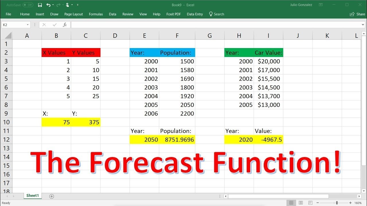
What is the FORECAST Function?
The FORECAST Function[1] is categorized under Excel Statistical functions. It will calculate or predict a future value using existing values.
In financial modeling, the FORECAST function can be useful in calculating the statistical value of a forecast made. For example, if we know the past earnings and expenses, we can forecast the future amounts using the function.
=FORECAST(x, known_y’s, known_x’s)
The FORECAST function uses the following arguments:
- X (required argument) – This is a numeric x-value for which we want to forecast a new y-value.
- Known_y’s (required argument) – The dependent array or range of data.
- Known_x’s (required argument) – This is the independent array or range of data that is known to us.
How to use the FORECAST Function in Excel?
As a worksheet function, FORECAST can be entered as part of a formula in a cell of a worksheet. To understand the uses of the function, let’s consider an example:
Suppose we are given earnings data, which are the known x’s, and expenses, which are the known y’s. We can use the FORECAST function to predict an additional point along the straight line of best fit through a set of known x- and y-values. Using the data below:
Using earnings data for January 2019, we can predict the expenses for the same month using the FORECAST function.
The formula to use is:
We get the results below:
The FORECAST function will calculate a new y-value using the simple straight-line equation:
Where:
and:
The values of x and y are the sample means (the averages) of the known x- and the known y-values.
The Excel FORECAST Function
What is a forecast function in Excel?
The FORECAST (or FORECAST.LINEAR) function in Excel predicts a future value along a linear trend. The FORECAST.ETS function in Excel predicts a future value using Exponential Triple Smoothing, which takes into account seasonality. Note: the FORECAST function is an old function.
How many forecasting functions are there in Excel?
In the recent versions of Excel, there exist six different forecasting functions. The two functions do linear forecasts: FORECAST – predicts future values by using linear regression; a legacy function for backwards compatibility with Excel 2013 and earlier.
How do I create a forecast in Excel?
In the Create Forecast Worksheet box, pick either a line chart or a column chart for the visual representation of the forecast. In the Forecast End box, pick an end date, and then click Create. Excel creates a new worksheet that contains both a table of the historical and predicted values and a chart that expresses this data.
How to create a visual forecast worksheet in Excel 2016?
Use the Forecast Sheet tool in Excel 2016 or later to automatically create a visual forecast worksheet. 1. Select the range A1:B13 shown above. 2. On the Data tab, in the Forecast group, click Forecast Sheet. Excel launches the dialog box shown below. 3.
