Pie charts are an excellent way to visualize data in Excel With just a few clicks, you can create a pie chart that provides simple yet insightful representations of your data
In this comprehensive guide, we’ll walk through the complete process of making a pie chart in Excel, from preparing your data to customizing the final chart
Here are the key steps we’ll cover:
- Structuring and selecting your data
- Inserting a basic pie chart
- Formatting and styling the chart
- Customizing chart elements like labels, colors, text, and more
- Adding value details and data tables
- Saving your pie chart for reports and presentations
Follow along below to learn how to make a polished, professional pie chart with Excel in just minutes.
Step 1: Structure and Select Your Data
The first step is preparing your source data for the pie chart. Best practices are:
-
Use a table format: Structure your data in an Excel table with column headers. This allows referencing the whole table for the chart versus individual cells.
-
Put categories in the first column: The categories for each slice should be in the leftmost column. Values or percentages should be in columns to the right.
-
Exclude totals: Don’t include totals or summary rows in your data table. Pie charts are best for showing category breakdowns.
-
Select the full table: With your table structured, select the entire table to leverage the data for the chart.
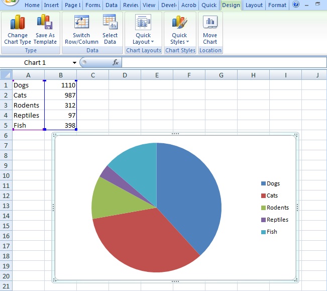
Step 2: Insert a Basic Pie Chart
Once your source data is ready, making the pie chart is simple:
-
On the Insert tab, click the Pie Chart icon.
-
Hover over the various pie and doughnut chart options, then select the one you prefer.
That’s it! Excel will automatically create a basic pie chart using the data you selected. Now let’s customize it.
Step 3: Format and Style Your Pie Chart
The default pie chart works, but often needs formatting and styling for a professional look. Here are key customizations to make:
-
Add a chart title: Click above the pie and type a descriptive title summarizing the data.
-
Style the slices: Click each slice and add custom fill colors, borders, transparency, and more effects.
-
Include data labels: Right click the pie and toggle data labels on to show values/percentages per slice.
-
Legend placement: Move the legend by clicking and dragging it in the desired position relative to the pie.
-
Font choices: Change fonts for the title, labels, and legend for improved readability.
-
Visual styles: On the Design tab, browse various built-in color palettes and style options.
Take time to thoroughly polish your pie chart’s look and feel to effectively convey key data insights.
Step 4: Customize Chart Elements
For deeper customizations, you can modify individual chart elements:
-
Slice labels: Rotate labels, adjust position relative to slice, and format numbers or add units.
-
Title text: Make the title dynamic by linking to a cell value. Update font size, color, and effects.
-
Legend: Enable or disable legend, adjust position, and modify text.
-
Data labels: Fine tune label text, position, formatting, color, and more.
-
Plot area: Control background colors, borders, 3D tilt angle, lighting, and effects.
Every element can be tailored to your preferences. Don’t be afraid to experiment!
Step 5: Add Supporting Details
Consider adding supplemental data details:
-
Data table: Shows the source data itself next to the chart for reference.
-
Slice value details: Display percentages, actual values, or custom text inside each slice.
-
Source label: Indicates where the data came from for clarity.
Supporting details give viewers more context when reading the chart.
Step 6: Save Your Chart
Finally, be sure to save your pie chart for reuse:
-
Name and save the Excel file with your chart if it’s not already saved.
-
To reuse the chart elsewhere, copy and paste it into other apps like Powerpoint.
-
When saving, choose PNG or JPG to preserve chart formatting. SVG retains editability.
Now you have a professional, informative pie chart ready for reports, dashboards, presentations, and more!
You Might Also Like
Written by:
1. Open Excel. 2. Enter your data. 3. Select all of your data. 4. Click the Insert tab. 5. Click the “Pie Chart” icon. 6. Click a pie chart template.
StepsPart
- Question How do I create a pie chart without percentages?
 Community Answer Youll have to make percentages. A pie chart by definition is 100%. If your data is not in percent, then Excel will create percentages for you.
 - Question How do I change the color of the pie chart?
 Community Answer Once you have the pie chart on the board, there are different shades next to it that says “change color”; click on that.
 - Question What am I doing wrong if I tried this method and the pie chart didnt show up?
 Community Answer You might have entered information wrongly and it cant process. Try re-entering your data.
- You can copy your chart and paste it into other Microsoft Office products (e.g., Word or PowerPoint). Thanks Helpful 0 Not Helpful 0
- If you want to create charts for multiple sets of data, repeat this process for each set. Once the chart appears, click and drag it away from the center of the Excel document to prevent it from covering up your first chart. Thanks Helpful 0 Not Helpful 0
Submit a Tip All tip submissions are carefully reviewed before being published
How to Make a Pie Chart in Excel
How do I make a pie chart in Excel?
To make a pie chart, select your data. Click Insert and click the Pie chart icon. Select 2-D or 3-D Pie Chart. Customize your pie chart’s colors by using the Chart Elements tab. Click the chart to customize displayed data. Open a project in Microsoft Excel. You can use an existing project or create a new spreadsheet .
How do I add data labels to a pie chart?
To add data labels to your chart: Select the chart by clicking on it. Click on the plus sign appearing at the top-right corner of your chart. From the Chart Elements drop-down menu, check the box for Data labels. This adds data labels to each slice of the Pie Chart, as shown below. Each slice now contains a number.
How do I add a pie chart to a slide?
Tip: You can draw attention to individual slices of the pie chart by dragging them out Click Insert > Chart > Pie, and then pick the pie chart you want to add to your slide. In the spreadsheet that appears, replace the placeholder data with your own information. For more information about how to arrange pie chart data, see Data for pie charts.
How to change the color of a pie chart in Excel?
We heard you and here’s how you can fix the colors of your pie chart in Excel. Select the chart. Go to the Chart Design Tab > Chart Styles > Change Colors. Click on it and you will see a menu of color palettes before you. Hover your cursor on any color palette to preview how it looks when applied to the chart.
