A histogram is a common data analysis tool in the business world. It’s a column chart that shows the frequency of the occurrence of a variable in the specified range.
According to Investopedia, a Histogram is a graphical representation, similar to a bar chart in structure, that organizes a group of data points into user-specified ranges. The histogram condenses a data series into an easily interpreted visual by taking many data points and grouping them into logical ranges or bins.
A simple example of a histogram is the distribution of marks scored in a subject. You can easily create a histogram and see how many students scored less than 35, how many were between 35-50, how many between 50-60 and so on.
Histograms are an important data analysis tool that allow you to visualize the frequency distribution of data. In simple terms, a histogram provides a graphical representation of the distribution of numerical data by grouping numbers into “bins” or ranges and displaying the count of numbers that fall into each bin.
In this comprehensive guide, you’ll learn
- What is a histogram and when to use it
- The step-by-step process to create histograms in Excel
- How to customize and format histograms for better data analysis
What is a Histogram?
A histogram is a column or bar chart that displays the frequency distribution of numeric data. The data values are divided into non-overlapping intervals called “bins” or “classes”. The height of each bar represents the number of data values that fall within that bin.
Histograms allow you to see the shape and spread of data distribution at a glance. The bins highlight the concentration of data points and patterns in the data.
Key properties of a histogram
- Works with numeric, continuous data
- Data is divided into bins or ranges
- Heights of bars represent frequency (count) of data points in each bin
- Bars are adjacent with no gaps
- Useful for seeing distribution of data
Histograms are used for univariate (single variable) data analysis. Common examples include analysis of test scores, income data, housing prices, product sales, etc.
When to Use Histograms
Histograms are most useful in these scenarios:
- Visually assess the distribution of numeric data
- Identify patterns, clusters, gaps, outliers
- Assess symmetry, skewness, spread of data
- Compare distribution of different data sets
- Determine appropriate measures of central tendency and statistical models
In short, histograms allow you to quickly visualize and understand the shape and spread of data. This guides further statistical analysis and modeling.
How to Create Histograms in Excel
There are a few different ways to make a histogram in Excel:
- Use the Built-in Histogram Chart (Excel 2016 and above)
- Use Data Analysis Toolpak
- Use FREQUENCY function
Let’s look at each of these methods:
1. Built-in Histogram Chart in Excel 2016 and above
The simplest way to make a histogram in recent versions of Excel is using the builtin Histogram chart.
Here are the steps:
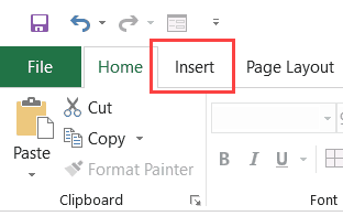
- Select the numeric dataset to analyze
- On the Insert tab, click the Histogram chart icon under ‘Statistical charts’
- Excel inserts a histogram with automatic binning
This chart has several customization options. You can right-click the vertical axis and use the ‘Format Axis’ pane to adjust bin width, number of bins, overflow/underflow bins etc.
The main advantages of the built-in histogram are ease of use and dynamic updating. As you change the source data, the chart adjusts automatically.
2. Using Excel’s Data Analysis Toolpak
For earlier versions of Excel, you can use the Data Analysis Toolpak add-in to create histograms.
Here are the key steps:
- Install Data Analysis Toolpak (go to File > Options > Add-ins)
- Select the data and bin ranges (class intervals)
- Go to Data tab > Data Analysis > Histogram
- Configure options in the Histogram dialog box
- Click OK to generate the histogram
The output includes a frequency distribution table and histogram chart on a new worksheet.
The main limitation is that the chart does not update dynamically when data changes. You have to recreate it manually.
3. Using the FREQUENCY function
You can also generate a dynamic histogram using Excel’s FREQUENCY function. The steps are:
- Create bins or class intervals on the worksheet
- Use the FREQUENCY function in an array formula to calculate frequencies
- Select frequency data and create a column chart
Here is the syntax:
=FREQUENCY(data_range, bin_range) Enter it as an array formula using Ctrl+Shift+Enter.
The resulting histogram updates automatically when the source data changes.
Formatting and Customizing the Histogram
Once you have created the basic histogram, you can customize and format it for better data analysis:
- Adjust bin sizes: Make bins wider or increase/decrease number of bins
- Add data labels: Show frequencies on top of bars
- Change axis scales: Use logarithmic scale or modify axis bounds
- Add titles and legends: Improve chart clarity
- Modify colors and fonts: Emphasize key data insights
- Overlay charts: Add a line chart to show distribution
Playing with these options helps highlight important patterns and trends in your data.
Here are some key histogram customizations:
- Show frequencies as percentages instead of counts
- Sort bins in ascending/descending order
- Include overflow/underflow bins
- Align bin edges to round figures (500, 10000 etc.)
- Show cumulative frequencies instead of regular frequencies
- Adjust gap width between bars to highlight differences
Limitations of Histograms
While histograms are immensely useful, they also come with some limitations:
- Only show distribution, not actual values
- Choice of bins affects shape
- Difficult to compare multiple histograms
- Do not indicate dispersion and outliers well
- Smoothen multimodal distributions
So histograms provide a good overview but may need to be supplemented with other statistical analysis.
Examples of Histograms in Excel
Let’s look at some examples to illustrate how histograms are created and interpreted in Excel:
Test scores: A histogram of student test results shows the distribution is slightly negatively skewed with a long left tail. Indicates many students scored below average.
Sales data: A histogram of daily sales data reveals seasonal trends. The distribution is low and narrow in winter months but high and wide in peak seasons.
Income data: Income data histograms are often highly positively skewed with a small number of very high earners. Log scale often used to visualize distribution better.
Defects: For manufacturing quality data, a histogram might display process capability and specification limits using underflow/overflow bins.
Histograms provide a simple yet powerful way to graphically visualize and assess the distribution of numeric data. Excel offers several methods to generate histograms that update dynamically when data changes.
Customizing bin sizes, scales, colors, and other options allows you to highlight key insights and patterns. Used appropriately, histograms improve data analysis and decision making.

Creating a Histogram in Excel 2016
Excel 2016 got a new addition in the charts section where a histogram chart was added as an inbuilt chart.
In case you’re using Excel 2013 or prior versions, check out the next two sections (on creating histograms using Data Analysis Toopack or Frequency formula).
Suppose you have a dataset as shown below. It has the marks (out of 100) of 40 students in a subject.
Here are the steps to create a Histogram chart in Excel 2016:
- Select the entire dataset.
- Click the Insert tab.
- In the Charts group, click on the ‘Insert Static Chart’ option.
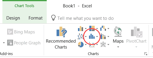
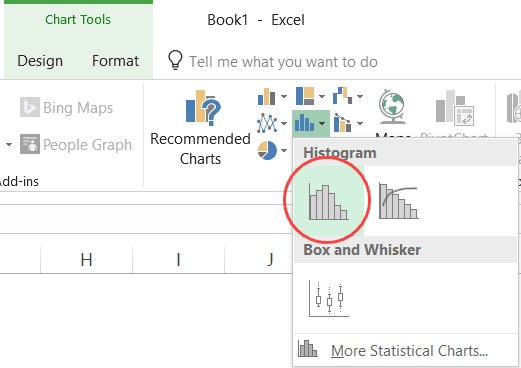
- In the HIstogram group, click on the Histogram chart icon.
The above steps would insert a histogram chart based on your data set (as shown below).
Now you can customize this chart by right-clicking on the vertical axis and selecting Format Axis.
This will open a pane on the right with all the relevant axis options.
Here are some of the things you can do to customize this histogram chart:
- By Category: This option is used when you have text categories. This could be useful when you have repetitions in categories and you want to know the sum or count of the categories. For example, if you have sales data for items such as Printer, Laptop, Mouse, and Scanner, and you want to know the total sales of each of these items, you can use the By Category option. It isn’t helpful in our example as all our categories are different (Student 1, Student 2, Student3, and so on.)
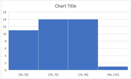
- Automatic: This option automatically decides what bins to create in the Histogram. For example, in our chart, it decided that there should be four bins. You can change this by using the ‘Bin Width/Number of Bins’ options (covered below).
- Bin Width: Here you can define how big the bin should be. If I enter 20 here, it will create bins such as 36-56, 56-76, 76-96, 96-116.
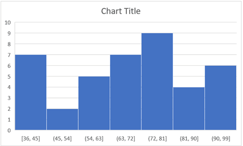
- Number of Bins: Here you can specify how many bins you want. It will automatically create a chart with that many bins. For example, if I specify 7 here, it will create a chart as shown below. At a given point, you can either specify Bin Width or Number of Bins (not both).
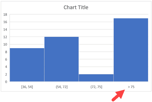
- Overflow Bin: Use this bin if you want all the values above a certain value clubbed together in the Histogram chart. For example, if I want to know the number of students that have scored more than 75, I can enter 75 as the Overflow Bin value. It will show me something as shown below.
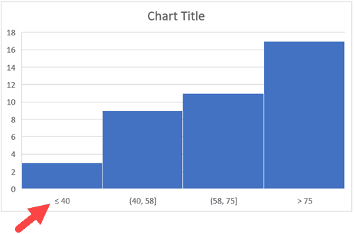
- Underflow Bin: Similar to Overflow Bin, if I want to know the number of students that have scored less than 40, I can enter 4o as the value and show a chart as shown below.
Once you have specified all the settings and have the histogram chart you want, you can further customize it (changing the title, removing gridlines, changing colors, etc.)
Creating a Histogram Using Data Analysis Tool pack
The method covered in this section will also work for all the versions of Excel (including 2016). However, if you’re using Excel 2016, I recommend you use the inbuilt histogram chart (as covered below)
To create a histogram using Data Analysis tool pack, you first need to install the Analysis Toolpak add-in.
This add-in enables you to quickly create the histogram by taking the data and data range (bins) as inputs.
How to Make a Histogram in Excel
How to make a histogram in Excel?
Create a list of numbers. Make a pre-counted list with the help of input data. Plot a histogram with data, color=red, and label=data, using hist () method. Plot another histogram with counted data, color=default, and label=counted_data, using hist () method. To place the legend, use legend () method. To display the figure, use show () method.
What is a histogram in Microsoft 365?
Excel for Microsoft 365 Word for Microsoft 365 Outlook for Microsoft 365 More A histogram is a column chart that shows frequency data. Note: This topic only talks about creating a histogram. For information on Pareto (sorted histogram) charts, see Create a Pareto chart. Which version/product are you using? Which version/product are you using?
How is a histogram different from a bar chart?
Histogram is different from bar chart as bar charts works with two data variables however Histogram works with one data variables (numeric). The intervals/groups used in this graphs are called bins/buckets and this bins are created with same interval or width. These bins are consecutive and non overlapping intervals.
