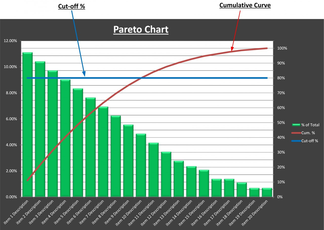
A Pareto or sorted histogram chart contains both columns sorted in descending order and a line representing the cumulative total percentage. Pareto charts highlight the biggest factors in a data set, and are considered one of the seven basic tools of quality control as its easy to see the most common problems or issues.
Pareto analysis is a powerful decision-making technique used in many fields, from business and economics to engineering and quality control. It is based on the Pareto Principle, also known as the 80/20 rule, which states that 80% of outcomes result from just 20% of causes.
In business, Pareto analysis helps identify and prioritize the most impactful problems, defects or issues a company faces so they can efficiently allocate resources to areas that will create the most improvement. Creating a Pareto analysis involves identifying, scoring and grouping problems, creating a Pareto chart, and using the findings to guide decision making
Steps for Creating a Pareto Analysis
Conducting a Pareto analysis involves a multi-step process
-
Identify and List Problems. Make a comprehensive list of all the issues, defects, problems or areas for improvement you want to analyze. Be as specific as possible in defining each one.
-
Identify the Root Cause of Each Problem. Determine the underlying root cause for each issue listed. Problems can have multiple causes so identify all relevant ones.
-
Score Problems. Assign a number to each problem based on the level of severity, frequency or impact on operations. This will help prioritize higher priority issues.
-
Group Problems Together. Categorize the problems into logical groups based on similarity. Common groups include customer complaints, technical issues, product defects, etc.
-
Add up Scores for Each Group. Sum the scores for all problems within each group. This shows the cumulative impact for that problem category.
-
Take Action. Use the analysis to guide resource allocation and process improvements, addressing high priority issues first. Continue to collect data and re-analyze over time.
How to Create a Pareto Chart
A key part of Pareto analysis is creating a Pareto chart to visualize the data. The steps include:
- Develop a list of problems to compare.
- Choose a metric like frequency, cost, or time lost.
- Collect data on each problem’s impact measured according to the chosen metric.
- Sort the problems from highest to lowest based on the data.
- Create a bar chart with the problems listed in descending order.
- Calculate and plot the cumulative percentage on a line graph.
- Analyze the chart to identify vital few causes of the majority of impact.
Pareto charts provide an easy-to-read graphical snapshot of the most significant factors or problems compared to more minor ones. They highlight through the length of the bars and the cumulative line which issues should get priority for process improvements.
Pros of Using Pareto Analysis
There are many benefits to using Pareto analysis as a decision-making methodology:
- Helps identify the root causes of problems or defects
- Focuses efforts on issues that provide the greatest impact
- Saves time byzeroing in on the “vital few” factors
- Prevents wasting resources trying to completely eliminate defects
- Optimizes decision making for efficiency
- Provides data-driven guidance for resource allocation
- Improves and prioritizes problem-solving efforts
- Highlights the cumulative impact of issues over the long-term
- Identifies strengths to maximize as well as issues to resolve
Cons of Pareto Analysis
Pareto analysis does have some limitations to be aware of:
- It doesn’t necessarily identify solutions, just the biggest issues
- Results rely heavily on accurate data collection and categorization
- The 80/20 rule is not an exact science; the real ratio varies case-by-case
- Analysis may be biased by choice of metrics or scoring methods
- It focuses on past data which may not reflect future trends
- The tool is more useful for identifying problems than opportunities
- Charts can only display qualitative data, not quantitative statistics
Steps to Implement Pareto Analysis
Follow these steps to put Pareto analysis into action:
-
Get stakeholder buy-in. Explain the 80/20 rule and benefits of Pareto analysis to get stakeholder alignment.
-
Form a team. Include subject matter experts close to the issues being analyzed.
-
List issues. Brainstorm issues, defects, complaints etc. that need attention.
-
Define metrics. Determine how you will score each problem’s impact.
-
Collect data. Gather measurements needed for analysis over a set time period.
-
Analyze data. Create a Pareto chart and identify vital few factors driving majority of impact.
-
Develop solutions. Determine improvement strategies for high priority issues identified.
-
Implement changes. Assign tasks, resources, and timelines to address vital factors.
-
Monitor results. Re-analyze data over time to see if changes are working.
-
Continuously improve. Repeatedly inspect processes and reapply analysis for ongoing gains.
Pareto Analysis Example
Here is an example Pareto analysis looking at the causes of shipping delays for a fictional company:
-
The team listed 20 possible reasons for late deliveries.
-
They scored each by the number of times it was cited as the primary cause.
-
The top 6 issues accounted for 75% of delays:
- Inaccurate inventory tracking (35 instances)
- Supplier delays (32 instances)
- Warehouse staffing shortages (28 instances)
- Equipment malfunctions (27 instances)
- Inclement weather (22 instances)
- Traffic jams (18 instances)
-
On the Pareto chart, these form the tallest bars clustered on the left, indicating the “vital few” causes of most delays.
-
Solutions were developed to improve inventory system accuracy, require suppliers to provide delivery buffers, hire more warehouse staff, implement a preventative equipment maintenance program, and improve delivery route planning.
Key Takeaways
-
Pareto analysis leverages the 80/20 rule to identify the minority of causes driving the majority of outcomes.
-
It helps prioritize the most impactful business issues to address efficiently.
-
Conducting Pareto analysis involves listing, scoring, and grouping issues, and creating a chart.
-
The visualized data highlights the “vital few” factors to focus improvement efforts on.
-
Pareto analysis is a simple but powerful tool to optimize decision-making and drive strategic gains.
By focusing time and resources on the right issues, Pareto analysis provides businesses an evidence-based way to work smarter, not harder in their improvement efforts. Proactively and continuously applying Pareto analysis can help companies achieve the Pareto Optimal state of maximizing output for minimal input.
Create a Pareto chart
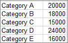
- Select your data. Typically, you select a column containing text (categories) and one of numbers. A Pareto chart then groups the same categories and sums the corresponding numbers.
 If you select two columns of numbers, rather than one of numbers and one of corresponding text categories, Excel will chart your data in bins, just like a histogram. You can then adjust these bins.
 - Click Insert > Insert Statistic Chart, and then under Histogram, pick Pareto. You can also use the All Charts tab in Recommended Charts to create a Pareto chart (click Insert > Recommended Charts > All Charts tab.
Tip: Use the Design and Format tabs to customize the look of your chart. If you dont see these tabs, click anywhere in the Pareto chart to add the Chart Tools to the ribbon.

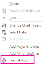
- Right-click on the chart horizontal axis, > Format Axis >Axis Options.
- Use the information below to pick the options you want in the Format Axis task pane.
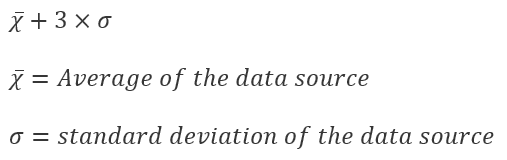
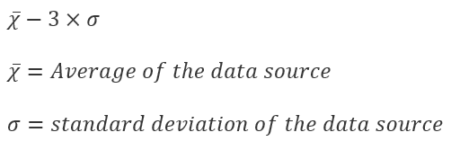
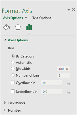 By Category The default when both data and text are plotted. The text categories are plotted on the horizontal axis and graphed in descending order. Tip: To count the number of appearances for text strings, add a column and fill it with the value “1”, then plot the Pareto chart and set the bins to By Category. Automatic This is the default for Pareto charts plotted with a single column of data. The bin width is calculated using Scott’s normal reference rule. Bin width Enter a positive decimal number for the number of data points in each range. Number of bins Enter the number of bins for the Pareto chart (including the overflow and underflow bins). The bin width will adjust automatically. Overflow bin Check the box to create a bin for all values above the number in the corresponding box. To change this value, enter a decimal number into the box. Underflow bin Check the box to create a bin for all values below or equal to the number in the corresponding box. To change this value, enter a decimal number into the box.
Formulas used to create histograms in Excel 2016
Scott’s normal reference rule:
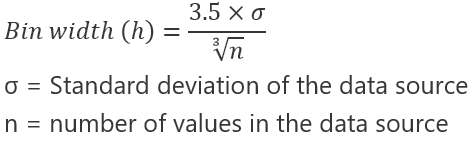
Scott’s normal reference rule tries to minimize the bias in variance of the Pareto chart compared with the data set, while assuming normally distributed data.
Overflow Bin
Underflow Bin
Pareto Analysis (how to create a Pareto Chart, analyze results, and understand the 80 20 Rule)
FAQ
How do you create a Pareto in Excel?
What is the Pareto formula?
What is a simple example of Pareto analysis?
How to create a Pareto chart?
Creating a Pareto Chart is a systematic process that involves data collection, chart construction, and analysis. Here’s a detailed walkthrough of each step The first step in creating a Pareto chart, if you have not already, is to collect data. Therefore, determine what you want to analyze with the Pareto chart.
What is a Pareto analysis in Excel?
A Pareto Analysis is particularly useful to focus on what really matters as the Pareto principle states that, for many events, roughly 80% of the effects come from 20% of the causes. 6 Pareto Analysis In Excel – Direct Pareto Analysis in Excel or Pareto Chart? What is the best?
What are the steps of Pareto analysis?
Here is a basic breakdown of the steps of Pareto analysis: Identify the problem or problems. List or identify the cause of the issues or problems, noting that there could be multiple causes. Score the problems by assigning a number to each one that prioritizes the problem based on the level of negative impact on the company.
Why is a Pareto chart called a basic analysis?
They are called “basic” because they require little formal training in statistics and can effectively address most quality-related problems. This article will focus comprehensively on the Pareto Analysis, its origin, how a Pareto Chart is constructed and its relevance in modern-day problem-solving.
