This blog will tell you all about Cohort Analysis in Excel, the steps involved, the benefits of using it, as well as its examples. Keep reading!
Understanding user retention and churn is critical for SaaS and subscription businesses. Cohort analysis provides valuable insights by grouping users based on shared traits and analyzing their engagement over time. Excel offers a flexible and visual way to conduct cohort analysis without coding.
Follow this simple 7-step guide to build a powerful cohort analysis spreadsheet from scratch:
Step 1: Import Your Data
To begin import your user data into a new Excel worksheet. The key fields needed are
-
User ID – A unique identifier for each customer.
-
Signup Date – The date the user initially signed up.
-
Engagement Dates – Dates of activity like logins, purchases, content views etc.
You may pull this data directly from your database, CRM, analytics or billing system. Ensure your date fields are formatted consistently.
Step 2: Create Your Cohorts
Next, define the cohorts, or groups of users, you want to analyze. Common options include:
-
Signup Month – Group users by the calendar month they signed up
-
Signup Quarter – Group by the quarter of signup
-
Marketing Campaign – Group users by the campaign that acquired them.
-
Plan Type – Group by the subscription plan users initially purchased.
The examples below use monthly signup cohorts. Add a column called “Cohort” and use Excel formulas like =TEXT(SignupDate,"yyyy-mm") to assign each user to a cohort.
Step 3: Define the “Months” Column
To view trends over time, you need a column indicating how many months after signup the user engagement occurred.
If Signup Date is in A2 and Engagement Date is in B2, use this formula to increment months after signup:
=DATEDIF(A2,B2,"M")
Copy this formula down for all rows to populate the “Months” column.
Step 4: Create a PivotTable Report
To analyze engagement by cohort and months after signup, create a PivotTable from your data:
-
Click inside your data set and go to Insert > PivotTable.
-
Drag fields to the appropriate areas:
- Rows: Cohort
- Columns: Months
- Values: User ID (Count)
-
Right click on any cell and filter for only Count of User ID > 0 to show only engaged users.
The PivotTable now summarizes users engaged per cohort per month after signup.
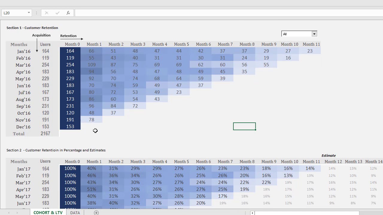
Step 5: Build a Retention Rates Sheet
The raw PivotTable counts are useful, but retention rates show percentage of users retained month-over-month.
To calculate:
-
Copy your PivotTable data to a new “Retention Rates” sheet.
-
Keep only the first 12 months of data.
-
Add columns for Month 0 user counts:
- In Cell D1, enter Month 0.
- In D2, use formula
=B2to copy initial cohort sizes. - Fill down column D for all cohorts.
-
Add columns for retention rates. Example for Month 1:
- F1: Retention Rate Month 1
- F2: =B2/D2
-
Fill the retention rate formulas across columns for all months.
Step 6: Determine Number of Users Retained
To track the actual number of retained users:
-
Insert columns after your original count columns.
-
In the first retention month column, use this formula:
- =B2-C2
-
This shows the number retained from Month 0 to Month 1.
-
Fill across all months and down all cohorts.
Step 7: Calculate Retention Rate Percentages
The final step is to convert retained user counts to retention rates:
-
Insert columns after your retained user columns.
-
Starting in the first retention column, use this formula:
- =F2/D2
-
Fill across all months and cohorts.
The completed cohort analysis now provides powerful insights into user retention trends over time and where drop off is occurring. You can add conditional formatting to highlight worrisome churn, plot trends in a chart, and calculate metrics like lifetime value.
By following this excel cohort analysis template, you can quickly unlock the full power of cohort analysis without technical expertise. The interactive spreadsheet equips you to:
- Identify periods of poor retention
- Assess performance of acquisition channels
- Optimize user onboarding flows
- Project lifetime customer value
Cohort analysis is a must for any SaaS or subscription business looking to boost engagement and retention. With this Excel guide, you have a tool to gain actionable insights to reduce churn and create more loyal customers.
Steps involved in Cohort Analysis Excel
Here are the steps involved in performing a Cohort Analysis Excel: Step 1: Collect the data
The first step in conducting a Cohort Analysis is to collect the necessary data. This data should include information about your customers or users, such as the date they joined, their purchase history, and any other relevant information you want to analyse.
In this step, you should also define the metrics you want to track and the main goal that you want to analyse during the analysis.
Step 2: Define the cohorts
Once you have collected the data, you need to categorise the data based on the cohorts you want to analyse. Cohorts are groups of customers or users who share similar characteristics. To define the groups, you will need to create a table that lists the unique values for the characteristic you want to analyse.
Cohorts are generally categorised based on three divisions:
a) Time: The Time category allows you to group your customers based on time frame. For example, organisations may choose to categorise their customer data based on the time of subscription to an email list.
b) Segment: The Segment category allows you to group your customers based on a specified segment. For example, organisations may choose to categorise their customer data based on the tier of subscription they have availed.
c) Size: The Size category allows you to group your customers based on the budget that needs to be spent on them. For example, organisations may choose to categorise their customer data based on the budget for ads targeted to specific groups of individuals.
Step 3: Calculate the metrics
Next, you need to calculate the metrics you want to analyse for each cohort. The common metrics that are measured are:
a) Customer Retention Rate (CRR): Customer Retention Rate refers to the percentage of customers who continue to do business with a company over a specified period of time.
Formula – CRR = ((E-N)/S) X 100, where,
E is the number of consumers at the end of the period,
N is the total number of consumers acquired during the period, and, S is the number of consumers at the start of the period.
The higher the CRR, the more successful a company is at keeping its existing customers loyal and happy. It is generally considered to be a positive indicator of customer satisfaction and brand loyalty.
b) Repeat Rate: Repeat Rate helps track customers who have interacted, purchased, or inquired with the business repeatedly in comparison to consumers who have only transacted with the business once.
Formula – Repeat Rate = N/T X 100, where,
N is the number of customers who have repeatedly transacted with the business, and,
T is the total number of customers.
c) Orders per Customer: Orders per Customer helps track the number of orders each customer places with the business. A high Orders per Customer metric means the retention rate for the service or product is high, implying the performance of the product is good.
d) Average Order Value (AOV): Average Order Value is a metric that helps the business identify high-value cohorts that need to be further targeted to build brand loyalty in a profitable way. Using this metric, businesses can differentiate between cohorts based on the revenue they bring and can specifically target customer groups that bring them the most profitability.
Step 4: Construct the cohort chart
Once you have calculated the metrics, you can create a cohort chart to visualise the data. A cohort chart is a stacked bar chart that shows how each group performed over the time period. The x-axis represents the time period, and the y-axis represents the size of the cohorts. Each bar in the chart represents the metric you are analysing.
What is Cohort Analysis Excel?
Cohort Analysis Excel is a tool for analysing customer behaviour over a period of time. It involves dividing customers into groups based on when they became a customer, i.e., their cohort, and then tracking their behaviour over time. Excel can be used to conduct Cohort Analysis by using formulae and pivot tables. To perform this analysis in Excel, you will need to organise your data by groups or strata, and track metrics such as Customer Lifetime Value (CLV), retention rate, and average purchase value over time.
The main purposes of Cohort Analysis are:
a) To help businesses understand how customer behaviour changes over time and identify areas for improvement in customer acquisition and retention strategies.
b) To help businesses calculate the lifetime value of a customer or user, which is the total revenue that a customer generates for a business over a period of time.
c) To help businesses understand the impact of changes they make to their products, services, or marketing strategies.
d) To formulate marketing strategies by identifying the most effective channels or campaigns for acquiring and retaining customers.
e) To optimise the product development lifecycle by identifying which features or product enhancements are most appealing to different strata of users.
How to Perform Cohort Analysis in Excel 2016
How to build a cohort analysis in Excel?
Whether you use Excel or enhance it with software, take the following steps to build a cohort analysis in Excel. 1. Import Data First, you need your data. You can either input customer information manually or import it from your customer database. Confirm the imported data has the characteristics you want to group your customers.
How do I conduct a cohort analysis?
The first step in conducting a Cohort Analysis is to collect the necessary data. This data should include information about your customers or users, such as the date they joined, their purchase history, and any other relevant information you want to analyse.
Why is cohort analysis important?
Cohort Analysis helps marketers and businesses separate growth metrics from engagement metrics since it’s easy for growth to mask engagement problems. The lack of activity of old users can be hidden by the high number of new users. In this article, you will be learning about Cohort Analysis and the steps for setting up Cohort Analysis Excel.
What is a cohort in Excel?
There are different ways of defining and calculating Cohorts in Excel. In this case, a Cohort will represent the month in which a customer was acquired.
