You can show or hide the legend of a chart. Showing a legend can give readers more information about the chart, while hiding a legend can give your chart a cleaner look.
A legend is a key component of most Excel charts. It explains what each data series in the chart represents using color coding and labels. But legends don’t just appear automatically—you’ll need to add them to your charts.
The good news is that adding a basic legend in Excel takes only a few clicks. But you can go further and customize the legend to tweak its position, labels, fonts, colors, borders, and more.
In this comprehensive guide, you’ll learn multiple methods to add legends to charts in Excel. You’ll also learn how to fully customize the legend for optimal clarity and presentation.
What is an Excel Chart Legend?
Before diving into how to add a legend, let’s briefly go over what a legend is and its key functions:
-
A legend shows colored symbols and labels pointing out the data series in a chart.
-
It tells you what each color-coded data series represents in the chart
-
It’s positioned on the side, top, or bottom of the chart area.
-
The legend entries match up to the series entries in the source data.
-
It’s essential for making your chart readable and understandable.
Here is an example showing a typical legend on the right side of a column chart:
![Excel chart legend example][]
Now that you know why legends matter, let’s look at how to add and work with them in Excel.
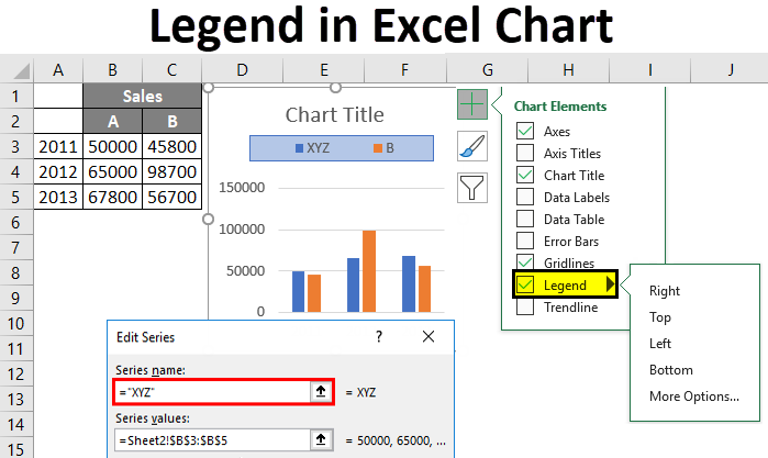
Method 1 – Add Legend Through Chart Tools
The fastest way to add a basic legend to a chart is using the Chart Tools contextual tab:
-
Create a chart from your source data.
-
Click on the chart to open the Chart Tools ribbon.
-
Go to Chart Elements > Add Chart Element.
-
Check the Legend box.
A default legend will now be added to your chart, usually on the right side.
The legend entries will match the data series labels from your source data table.
This method adds a basic legend in just a few clicks. Next, let’s look at customizing the legend.
Customizing the Chart Legend
Once added, you can customize various aspects of the chart legend:
- Position – Top, bottom, left, right, or corner.
- Legend labels – Edit the text entries.
- Font & font size – Change font styles and sizes.
- Colors & borders – Change fill colors and border styles.
- Reordering – Reorder the legend entries.
Let’s go through each of these options in more detail:
Change Legend Position
To reposition the chart legend:
-
Click on the legend to select it.
-
Under Legend in Chart Elements, click the arrow icon.
-
Choose a new legend position like top, bottom, left, etc.
Edit Legend Labels
To edit the text entries in the legend:
-
Click the chart and go to Select Data under Chart Design tab.
-
Choose the legend entry and click Edit.
-
Change the Series Name and hit OK.
This changes the legend label for that data series.
Change Fonts and Sizes
To change fonts and sizes for the entire legend:
-
Click on the legend to select it.
-
Go to Home tab and pick the new Font and Font Size.
Customize Legend Colors and Borders
To add color fills or borders to the legend:
-
Right-click the legend and choose Format Legend.
-
Go to Fill and Border to pick colors and border styles.
Reorder Legend Entries
To reorder the items in the legend:
-
Click on the chart and go to Select Data.
-
Use the arrow buttons to reorder the legend entries.
Take time to carefully customize the legend for maximum clarity and fit with your chart design.
Method 2 – Add Legend Without Chart
You can also add a legend to explain color coding in cells, without having an actual chart.
For example, to indicate Excel table rows that meet certain criteria.
To add a standalone legend:
-
Select the cells with the color coding.
-
Go to Home tab and click on Conditional Formatting.
-
Choose New Rule and go to Use a formula to determine…
-
Enter a formula like
=MOD(ROW(),2)=0to color every other row. -
Fill the legend cells with the colors.
-
Add text labels next to the colors.
This gives you a legend to explain the color coding, without needing a chart.
When Should You Use a Legend?
Legends are important for clearly presenting charts and data visualizations. But are they always necessary? Here are some guidelines on when to use a legend:✅ Multiple data series – Essential for distinguishing between different data sets.✅ Non-sequential colors – Needed if colors aren’t sequential like red-orange-green.✅ Diverging colors – Use when colors diverge at a critical midpoint value.✅ Unconventional charts – For unusual charts like polar, radar, etc. ❌ Single data series – Unnecessary for single data series charts.❌ Sequential colors – May not be needed if using sequential color scheme.❌ Very simple charts – Self-explanatory charts may not require a legend.
Alternatives to Standard Legends
For certain complex charts, a standard legend may not meet your needs. Some alternatives include:
- Small legend keys embedded in the chart bars.
- Text labels directly on the data points.
- A separate key beside the chart explaining colors.
- Data point tables below the chart rather than a legend.
Get creative with how you represent data series information if a basic legend isn’t cutting it.
Common Legend Problems and Solutions
Here are some troubleshooting tips for common legend mishaps:
Legend missing – Add legend through Chart Elements menu.
Wrong labels – Edit text entries under Select Data.
Redundant legend – Remove if chart is very simple.
Poorly placed – Reposition for clarity.
Legend truncated – Increase chart area to fit legend.
Too many entries – Split into separate charts.
Spend time resolving any legend problems to maximize chart effectiveness.
Interactive Legends with Slicers
An interesting alternative to static legends is using Excel slicers to create interactive legends.
Slicers let users filter out data series directly on the chart canvas.
To add slicers:
-
Create a pivot chart from your data.
-
Go to PivotTable Analyze tab and click Insert Slicer.
-
Pick the field to filter chart data series.
The slicer selection controls legend visibility interactively.
VBA Code to Manage Legends
You can use VBA code to programmatically manage legends in Excel. Useful macros include:
- Add or delete a legend.
- Change legend position.
- Modify legend text.
- Customize fonts, colors, borders.
- Toggle legend visibility on/off.
Here is an example VBA code to delete the legend in Chart 1:vb ActiveSheet.ChartObjects("Chart 1").Activate ActiveChart.Legend.Delete
This automates legend tasks for quicker chart formatting.
In Summary
Here are some key tips to keep in mind when working with chart legends in Excel:
- Know when legends are essential vs. unnecessary based on the chart complexity.
- Add basic legends through the Chart Elements menu.
- Customize the position, labels, fonts, colors, borders, and order.
- Use interactive slicers to create dynamic filterable legends.
- Leverage VBA to automate legend formatting for multiple charts.
- Address common legend issues like missing entries or cluttered positioning.
Mastering legends will help you create polished, professional charts that are easy for audiences to digest and understand.
Hide a chart legend
- Select a legend to hide.
- Press Delete.
Show a chart legend

- Select a chart and then select the plus sign to the top right.
- Point to Legend and select the arrow next to it.
- Choose where you want the legend to appear in your chart.
Add a Legend to a Chart in Excel
How do I add a legend to a chart in Excel?
Click the chart. Click Chart Filters next to the chart, and click Select Data. Select an entry in the Legend Entries (Series) list, and click Edit. In the Series Name field, type a new legend entry. Tip: You can also select a cell from which the text is retrieved. Click the Identify Cell icon , and select a cell. Click OK.
How do I change the legend in Excel?
Click Add Chart Element > Legend. To change the position of the legend, choose Right, Top, Left, or Bottom. To change the format of the legend, click More Legend Options, and then make the format changes that you want. Depending on the chart type, some options may not be available.
How to use a legend in Excel?
Using a legend on your spreadsheet will make it much easier to read the data and understand what the chart represents, emphasizing the important points. Follow these simple steps to learn how to accomplish this in a few simple steps: 1. Click on your chart. 2. Go to the Design tab. 3. Pick Add Chart Element. 4. Choose Legend. 5.
How do I change the Order of Legends in Excel?
To change the order of legend entries in Excel, click on the chart to activate the “Chart Tools” tab, then select “Select Data.” In the “Select Data Source” dialog box, click “Edit” on the right side of the “Legend Entries (Series)” list box, and then change the series order under “Series Values.” Can I change the legend text in Excel?
